Section 4
Intermission
Data Ethics
This intermission has two data ethics lessons, which you can conduct over the 2-day period that is suggested for student data gathering.
Intermission
Data Talk
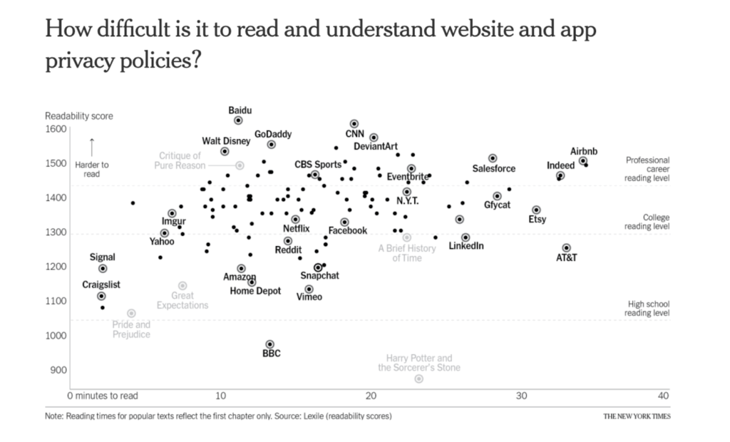
Share the ‘Readability of Privacy Terms’ visual with the students (Slide). Ask students:
- What do you notice?
- What do you wonder?
- What story does this graph tell?
Intermission
Introduction to Data Ethics
There are many ways people use data and as we dive into a world with data science as a tool helping us to understand patterns we see in the world and our lives we need to also talk about the ethics of using data. Understanding data and how to use it is powerful – and in the words of Uncle Ben from Spider-Man, “with great power comes great responsibility”. Using this power to the detriment of society with or without consideration of impact leads us to the importance of Data Ethics conversations. Who is collecting data? How is it being used? How do we critique the use of data as educated consumers of information? This is just the beginning of the conversation, it is integrated in our discussions about data as we move through this course together on the path of becoming ethical Data Scientists.
Share with your students that they are telling a story about themselves in the Dear Data project. You can collect your own data. But you aren’t the only one interested in the variability of your experience and telling a story about it. In your day to day life, there are other stories being told about you. Companies and the government collect data about you. When you use any of your electronic devices: iPhones, computers, Alexa, Nest, apps, Google, social media accounts, websites, etc data is collected on you. Each of your apps and social media accounts have privacy settings about what information companies can collect about you. When you go on a website at the bottom of the page it often asks you to accept cookies. Where the website tracks your movements, personalizes, and saves information about your time on their site. These are just a few examples of ways data is collected about you.
Before starting the video, ask students why they think the privacy data visual was used in an introduction to our conversation around data ethics. As you are discussing this, notice if students are acknowledging the difficulty level of the writing used in the terms and conditions and companies may be using your data in ways that you are not aware.
Set students up to watch this video that captures people on the street prompted to read and react to the terms and agreements of an app. Have them consider the following questions as they watch it. (Video Slide, Discussion Question Slide)
- What did you learn about data?
- What does this make you wonder?
- What questions does this leave you with?
- Why do you think privacy is part of the data ethics conversation?
Once the video is done have students write about the prompts to prepare for a class discussion. Give students at least two minutes for writing.
Invite students to discuss their responses to the questions about the video. Make space for as many students to contribute to this discussion as possible. During the discussion students will likely share ideas about the scary ways apps use data. Listen for ideas that contrast this fearful outlook. Add a discussion around the benefits to the conversation explicitly by inviting students to consider the benefits of sharing data with different apps.
Materials Required
Privacy Project Video
Intermission
Misuse of Data
Note to teacherThere are a lot of percentages used in the data visuals in this activity. Based on the needs of your students and context, consider including a short activity before the Misuse of Data. This will give students an opportunity to think about the meaning of percents, percent of, ratios and proportions, and how to calculate percent. Look at the graphs here to consider what types of questions you might include.
Frame the next Data Ethics conversation saying something like, “As we move through the Data Science Process when working with data, there are Data Ethics questions at each stage. When we gather data we consider where the data comes from, who collected it, and how it was collected. When we model and communicate the data we consider what data is being used, how it is being used, and how we critique the use of data as educated consumers of information. This is the aspect of Data Ethics that we will explore in the next activity.”
When launching the activity, say something like, “The goal of this next activity is for you to understand the importance of bringing your critical thinking to how data is used in articles, tweets, facebook and more. It is essential to ask questions of the story presented, since what is presented may not be the complete ‘truth’. You should always ask, ‘Is there more to the story?’”
Share with them that they will be looking at four different pairs of data visuals to consider these questions about how data can be misrepresented. The first of the pair of visuals will share data that is true, but misleading. The second of the pair will show a bigger picture with more data. For each, you will tell what story each piece of data tells. You will then give specifics on why the first visual is misleading given the additional data given in the second graphic. Tell students that this part of being a Data Scientist requires them to be a skeptic in their approach to interpreting data. Invite students to share ideas about what a skeptic would do or say when interrogating a data visual.
When discussing students’ ideas about being a skeptic, introduce the Skeptic framework by telling students they need to be convincing. A wonderful teacher named Cathy Humphreys uses this framework. In mathematics we must always be convincing. The first level of convincing is when you convince yourself. The second level of convincing is when you convince a friend. The third and most challenging level is when you try to convince the skeptic.
Let your students know that the topics in this activity are sensitive topics. Say something like,
“One of the goals of this course is to become critical consumers of data and data visuals. Keep in mind, however, that these topics hit close to home for many of us in different ways. The topics in this section have to do with polio vaccinations and death rates, DACA recipients and crime rates, and taxes and income. These are all sensitive topics for different reasons. If I am a DACA recipient or have close friends or family who are, this is a very important and personal topic to me. If I have experienced a death related to COVID, then talking about vaccinations and death rates can be an emotional topic. We don’t want to avoid these topics because they are sensitive, but we do want to understand and be supportive of our classroom community as we talk about them.”
Set students up to work in groups to discuss the ethics of a collection of data visuals. Share the activity handout and data visual resources with students, Misuse of Data (Handout A) & Visual Resources. Let them know that all of the resources in the activity come from the book, Data and Data Graphics for this activity from Alberto Cairo, How Charts Lie, Chapter 4. Make mention that knowing where you are getting information from is an important piece of being a data scientist.
While students are working, encourage them to be skeptics about the numbers and visuals. Remind them that skeptics ask a lot of questions to make sense of what they see, what it means, and if it’s valid. Encourage them to find specific parts of the visuals to use as evidence to make sense of what it communicates.
Listen to what students are noticing, some examples of what they might bring up below:
- How area is used to compare amounts: the size of the rectangles compared to each other and the size of the circles compared to each other
- There is an issue reporting numbers without including the total number that the data is out of (2,139 out of how many?, 40 out of ____, 99 out of _____)
- Average can be misleading. You lose a lot of data when you report an average because the values can have such a large range that one number doesn’t capture the situation.
- When is it better to use actual numbers of people or rates? When sharing data about hunger, poverty, or other humanitarian topics, you can lose a sense of magnitude when you report percentages. Using the numbers of people humanizes the data and story.
- When and how can rates be used to make comparisons? For example, we could use the rate of people getting smallpox who are not vaccinated to predict how many people would have been infected if no one got the vaccine. This would have been 0.4 x 1,000,000. In this case this would have been a more valid number to compare to the 99 who died after getting the vaccine.
Note to teacherHere are additional teacher notes about each visual and how the data is misused.
After students have had an opportunity to work through the three pairs of graphs. Debrief each pair of graphs as a class. As groups share out around each pair, begin to build a class list of misuses of data that we should be aware of when looking at data and data graphics. For example, reporting values without a comparison group can be very misleading.
Materials Required
Misuse of Data Handout
Misuse of Data Slides
Misuse of Data: Teacher Notes